“This will be quick and easy,” she thought.
I went into this project thinking that this wouldn’t be too difficult. New wallpaper, a fresh coat of paint, a new window shade, and a change of lighting. That’s it! It has taken some time though, as these things often do when you’re doing all of the work yourself and fitting it in around other work and life in general.
The bathroom on the first floor had a lot going for it that I liked. It’s small by modern standards, but perfectly sized to me. The beadboard is charming, the wood floor keeps continuity with the rest of the house, and the leaded glass window offers privacy. The antique console sink is adorable! The separate hot and cold taps are not ideal, but we’re used to them (we had separate taps at our old house too). I also like the antique toilet and its wooden tank. The photos below are from the bathroom as it was when we first moved in.
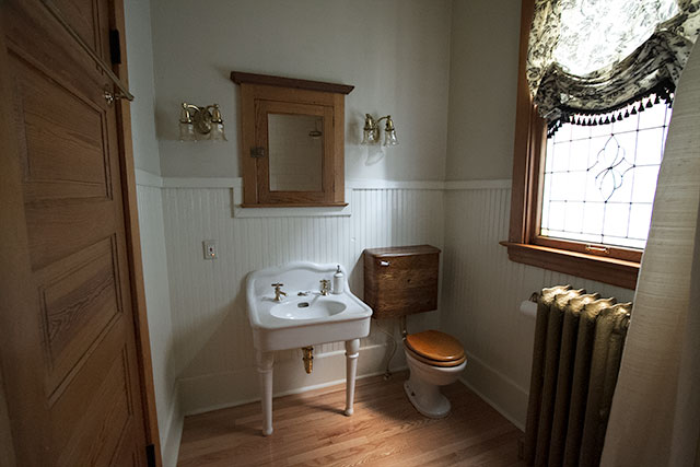
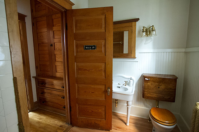
Hello, inspiration. And wallpaper.
I swapped the wooden toilet seat for a black one years ago and I think that for a toilet, it’s really good looking. Other than that, we hadn’t done anything in the bathroom because while it wasn’t anything I had chosen, I thought it all looked rather nice. But it was time for a change! I found this snakes wallpaper and felt inspired. I know it’s not for everyone, but I’m excited and it’s going to be so good in the bathroom.
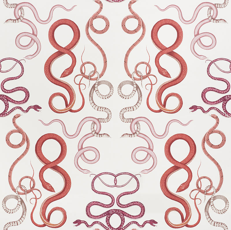
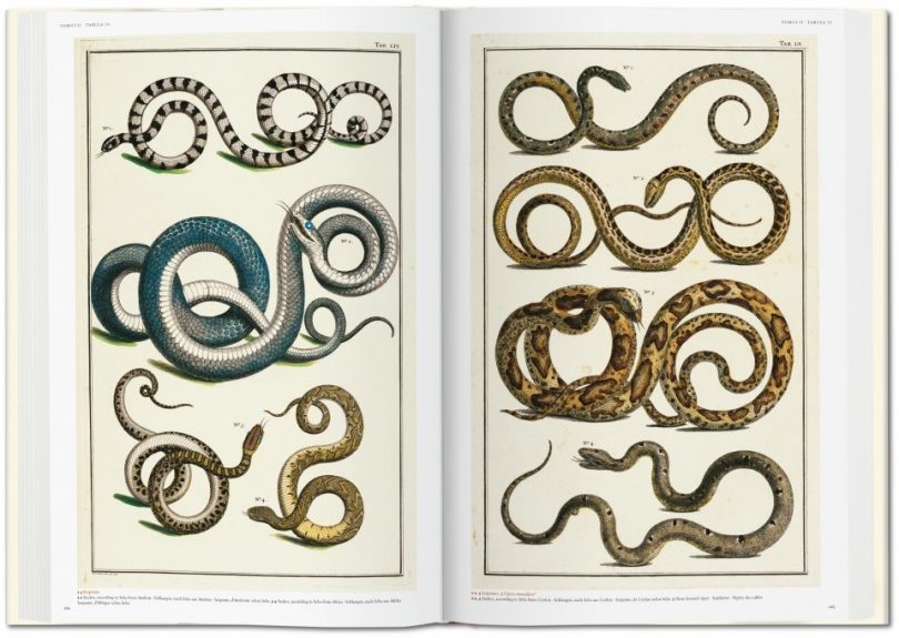
Big Cabinet of Natural Curiosities vibes. ↓
This pandemic year has been weirdly great for my creativity, and then completely zonking my energy level and sense of time passing. But hey, who came up with a plan to affordably refresh a good portion of the first floor so that it all feels fresh and works together and looks amazing? This lady.
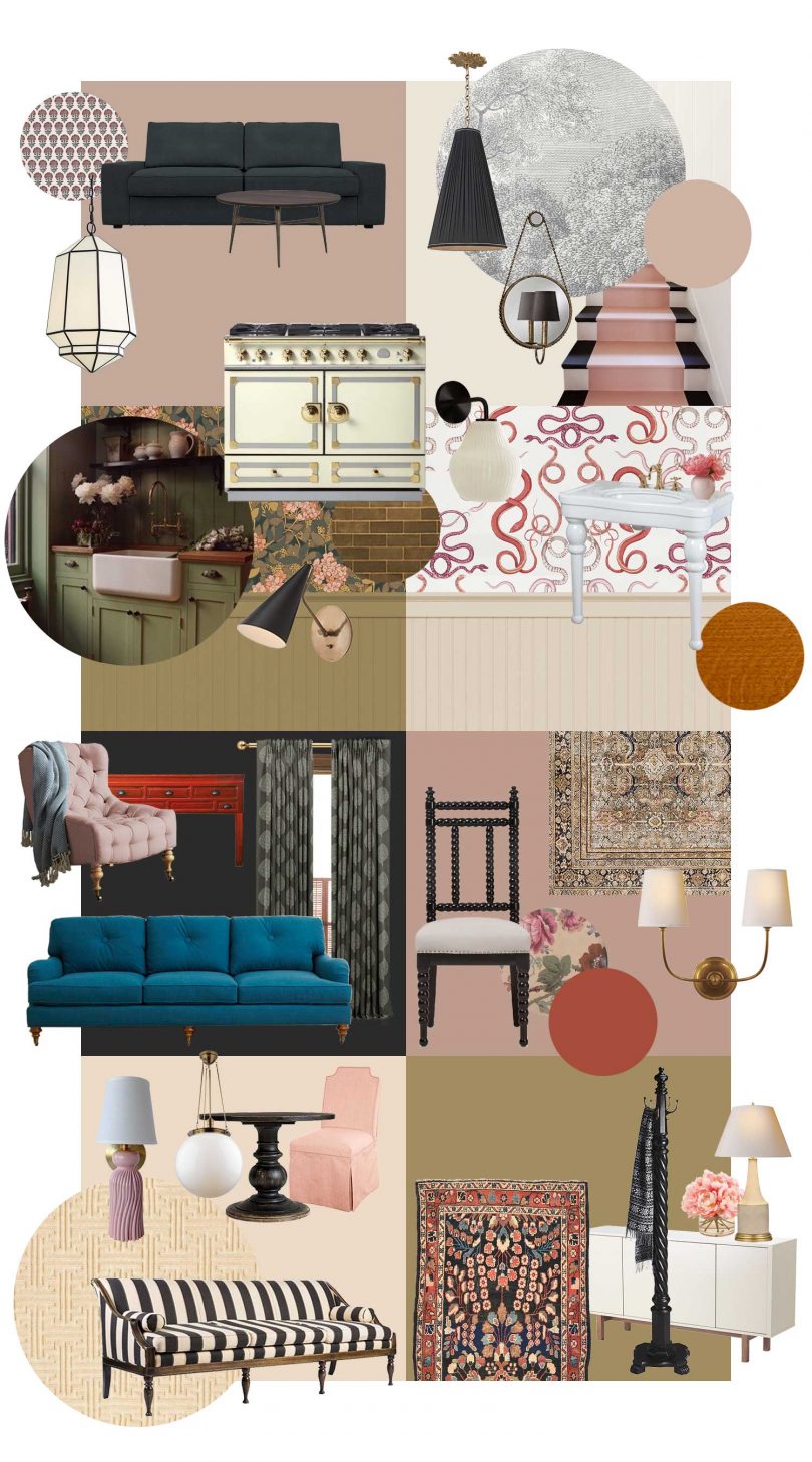
Kitchen plans on the blog to come! I’m always more up to date in sharing on Instagram these days, especially in Stories, so I’d love to have you follow along there if you’re not already.
Lighting
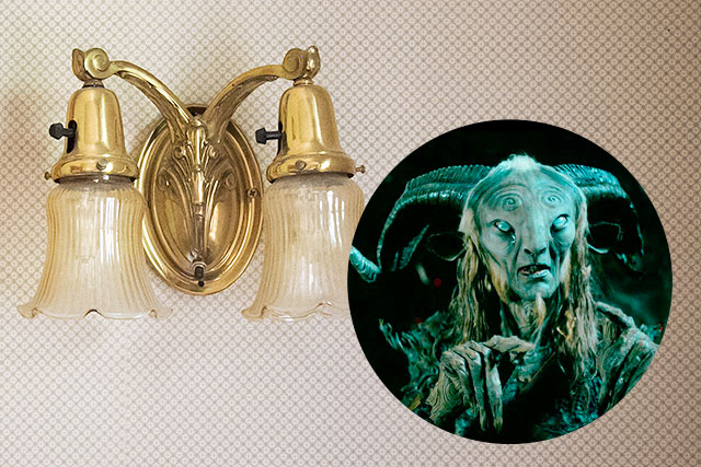
OK, we’ve got the main jumping off point, the snakes wallpaper. The tiled shower is not changing, and the fixtures are staying. What can go though are those old Guillermo del Toro sconces.
These Sculptural Glass Ribbed Pendant and matching Sculptural Glass Ribbed Sconce are from West Elm. I like the look of them on their own, but also appreciate that they reference the ribbed Victorian glass shades that were in the room before, with a definite Noguchi Akari influence. And they are damp-rated, which is something to pay attention to when selecting fixtures for a bathroom.
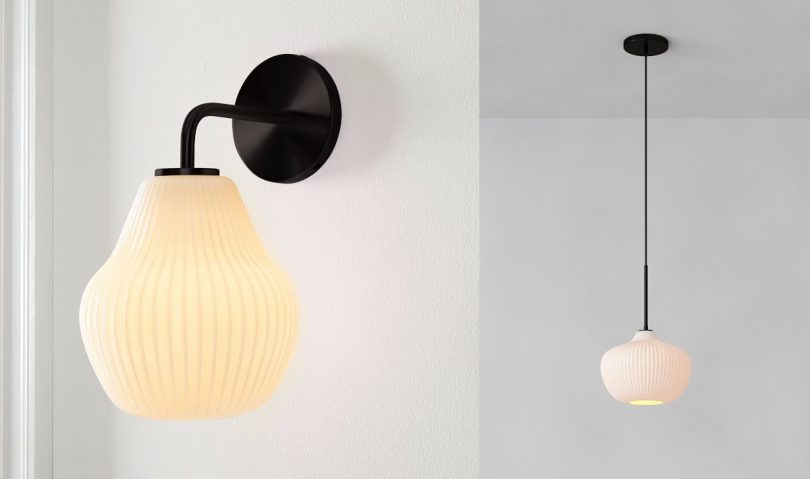
The lights have been here for a while but I held one of the sconces over a light bulb the other day and it was beautiful when lit up!
There’s a junction box in the ceiling and what seems to be a corresponding light switch. I’ve already taken the cover plate off and the wires inside look to be newer than some of the horrors I’ve uncovered in this house. Will it work when I hook up a light? Let’s hope! Otherwise, that’s a job for an electrician. I am doing all of this work myself and I can swap out light fixtures, but I don’t feel confident in DIY troubleshooting of electrical issues.
Fabric
I liked the roman shade that was here with its etching-style illustrations of birds and tassel fringe, but it doesn’t go with the new design. My first thought for a new fabric was to go with stripes, but between the fabric, ribbed glass shades, and beadboard, it would have been too much. If I were going to choose a solid color, I’d match the ivory linen of our shower curtain. Nice and easy. But we never ever do nothing nice and easy.
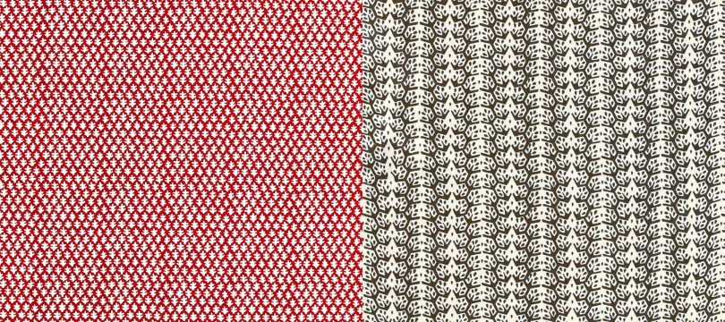
It’s between these two Sister Parish fabrics (Burma in red and Cecil Stripe in dark brown). There was a flash sale and I got such a good price that I ordered both.
Paint
So easy. Our dining room is pink with a red ceiling. The kitchen and it’s little hallway/storage area will be, essentially, Caca Dauphin. (Did you know that story!?) The bathroom is between these two saturated, colorful spaces.
I am not painting the quarter sawn oak on the first floor, but everything else was fir or pine, and I am completely fine with painting that. The doors on the second and third floor are all black, and now the bathroom door is as well. The door trim, window trim, and medicine cabinet have all been sanded and primed, and I’ve given them and the beadboard all a matching coat of satin paint in Benjamin Moore’s Bare Essence. It’s a warm neutral, and a match for Farrow & Ball’s Joa’s White. It’s also a near match for the existing shower tile and looks great with the new wallpaper.
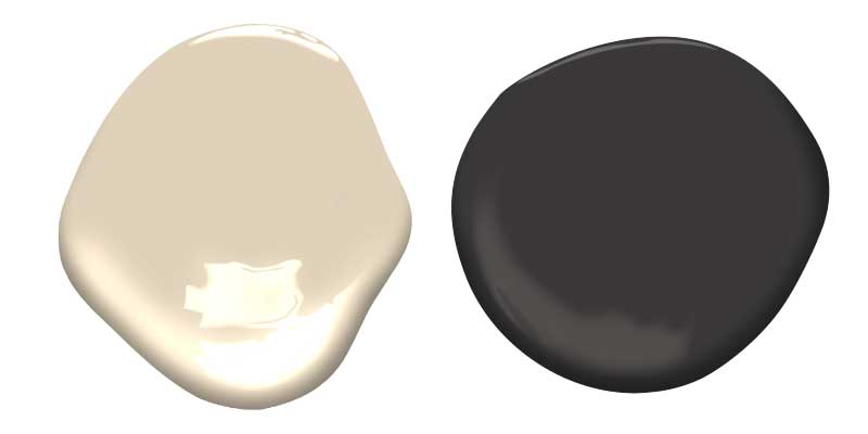
The Bathroom Design
All together now!
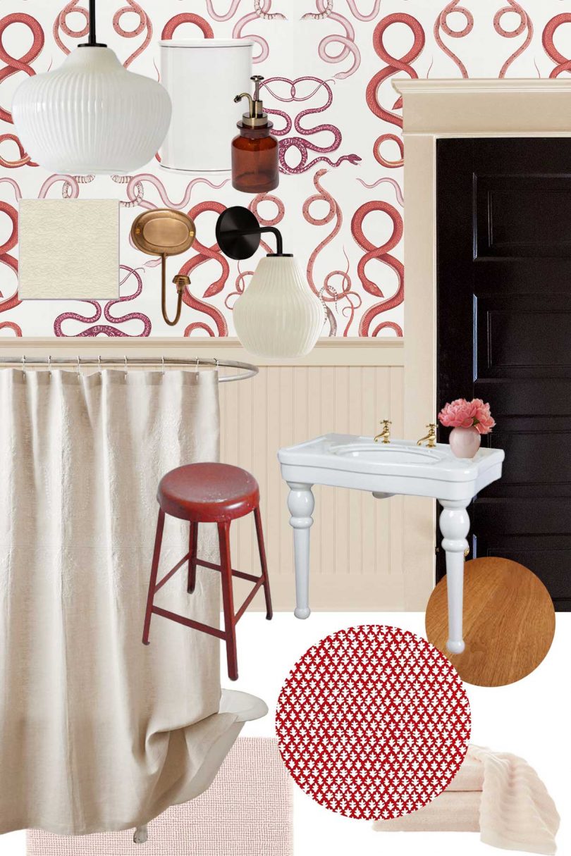
- Sculptural Glass Ribbed Sconce, West Elm
- Sculptural Glass Ribbed Pendant (9.5″), West Elm
- Giove (Ruby/Garnet) Schumacher Wallpaper, Wayfair
- Bare Essence, Benjamin Moore (Aura, Satin), Black Beauty, Benjamin Moore (Aura, Semi-Gloss)
- Vintage-Washed Belgian Flax Linen Shower Curtain (Ivory), Restoration Hardware
- Sister Parish Burma Fabric (Red) or Cecil Stripe Fabric (Dark Brown)
The painting is just about done — I need to do one more coat on the window and medicine cabinet. Then it’s a coat of wallpaper primer on the walls (Shieldz) before I can hang wallpaper and finally install the sconces. Roman shades are not the easiest to make, but I’ve gotten a little experience with them now and feel good about my window treatment skills. Slithering along.
© 2021, published by Making it Lovely as Bathroom Design Plans | No comments | This post may contains affiliate links; I will be compensated if you make a purchase after clicking on my links.
The post Bathroom Design Plans appeared first on Making it Lovely.
No comments:
Post a Comment