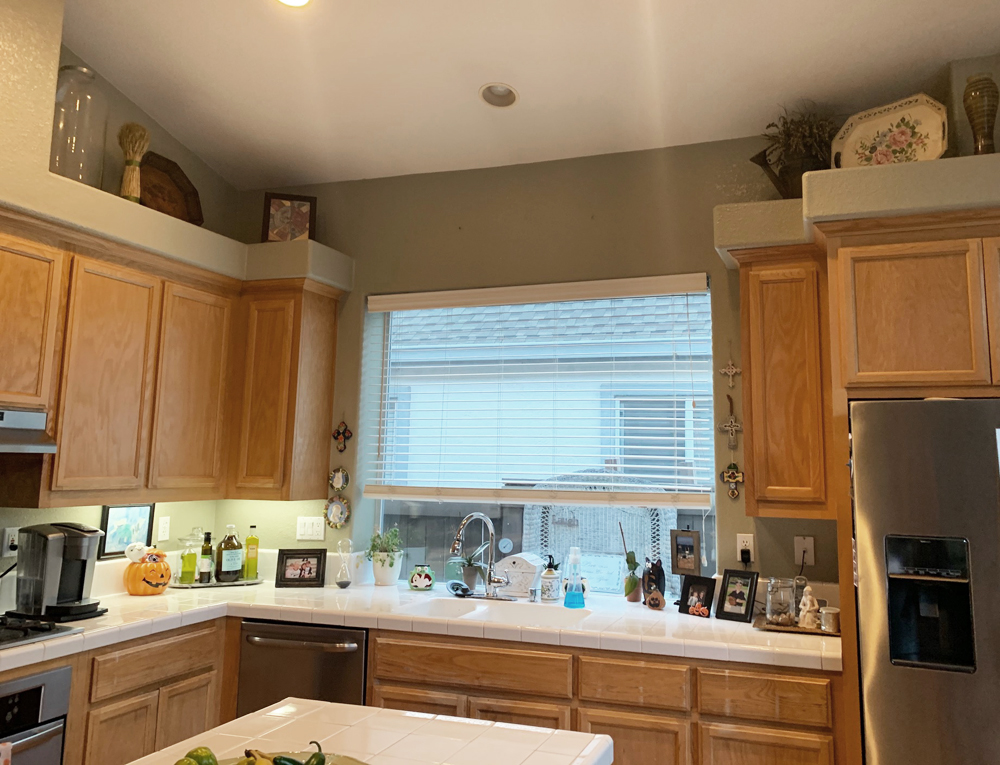
In late 2019, my client Christina wrote to me and asked if I could help her update her dated 1990s oak kitchen and we set an appointment to meet her in her home. I shared with her all of my ideas for how to modernize her space, she hired me as her design consultant, and we got to work. Christina loves to entertain and plays host during the holidays so she wanted a space where she could spend time with her family but also invite guests over for celebrations large and small.
We discussed every detail along the way, from paint colors to appliances and tile. At last the space is finished! I stopped by her home this week because I wanted to photograph her kitchen so I could share it with all of you.
We had to laugh as we reminisced about this transformation because the hope was to have the kitchen completed last summer but, ahem… global pandemic. Christina and John had to put their kitchen remodel on pause for many months, and they were finally able to get the finishing touches in place early this year. The space changed dramatically and it was so worth the wait. Story below!
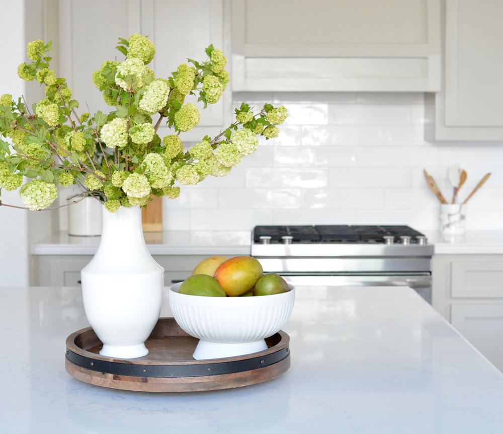
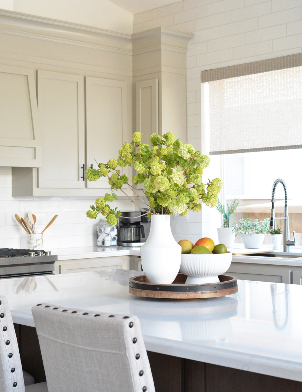
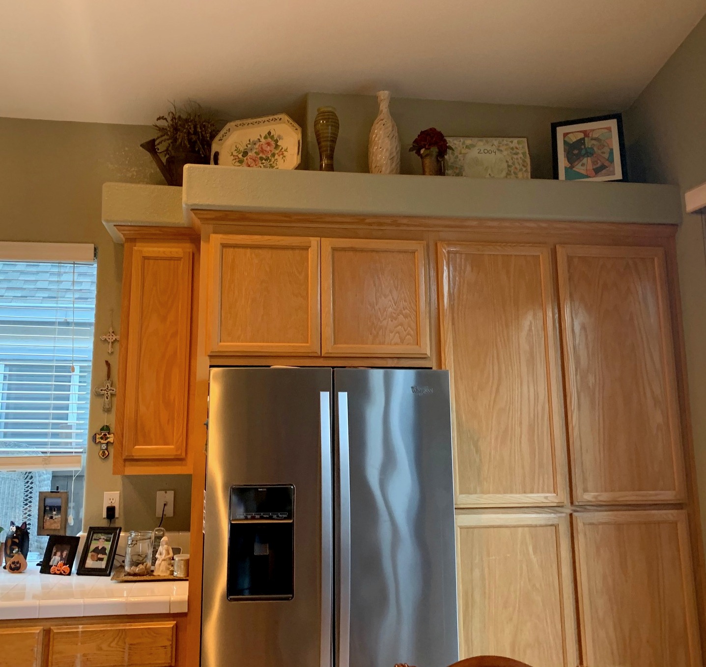
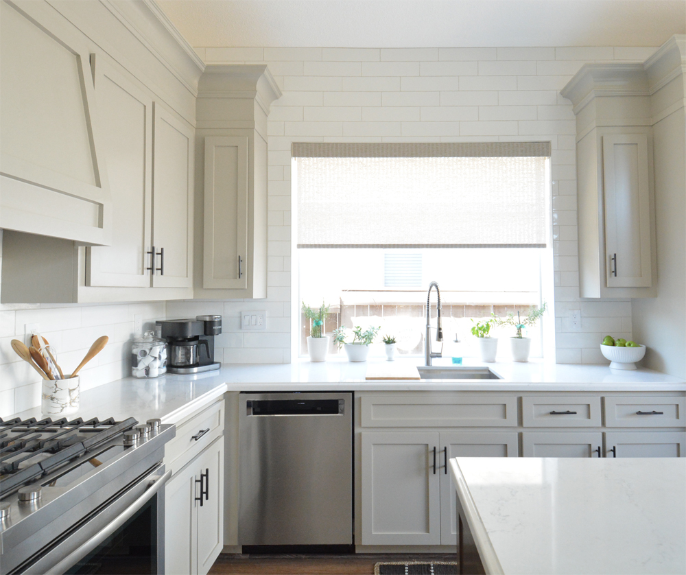
A year ago I wrote about cabinet and hood options for tall ceilings, and shared this image of Christina’s kitchen progress. I’m happy to report we accomplished everything we planned together. It’s hard to believe it’s the same space, how beautiful is this before and after!

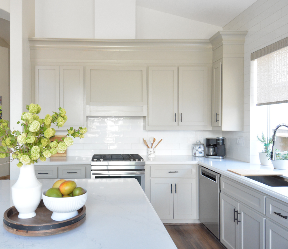
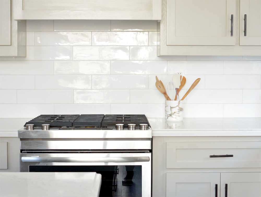
Notice all the changes on just this wall. Together with her husband and with the help of local contractors they did the following: 1) replaced all the doors and drawers with shaker style fronts, 2) had the cabinets professionally primed and painted, 3) removed the soffit and substituted tall crown molding, 4) replaced ceramic countertop with solid quartz, 5) removed built-in oven and substituted slide in range, 6) removed stainless hood and substituted custom range hood, 7) installed new backsplash, and 8) painted walls soft white.
Amazing difference!
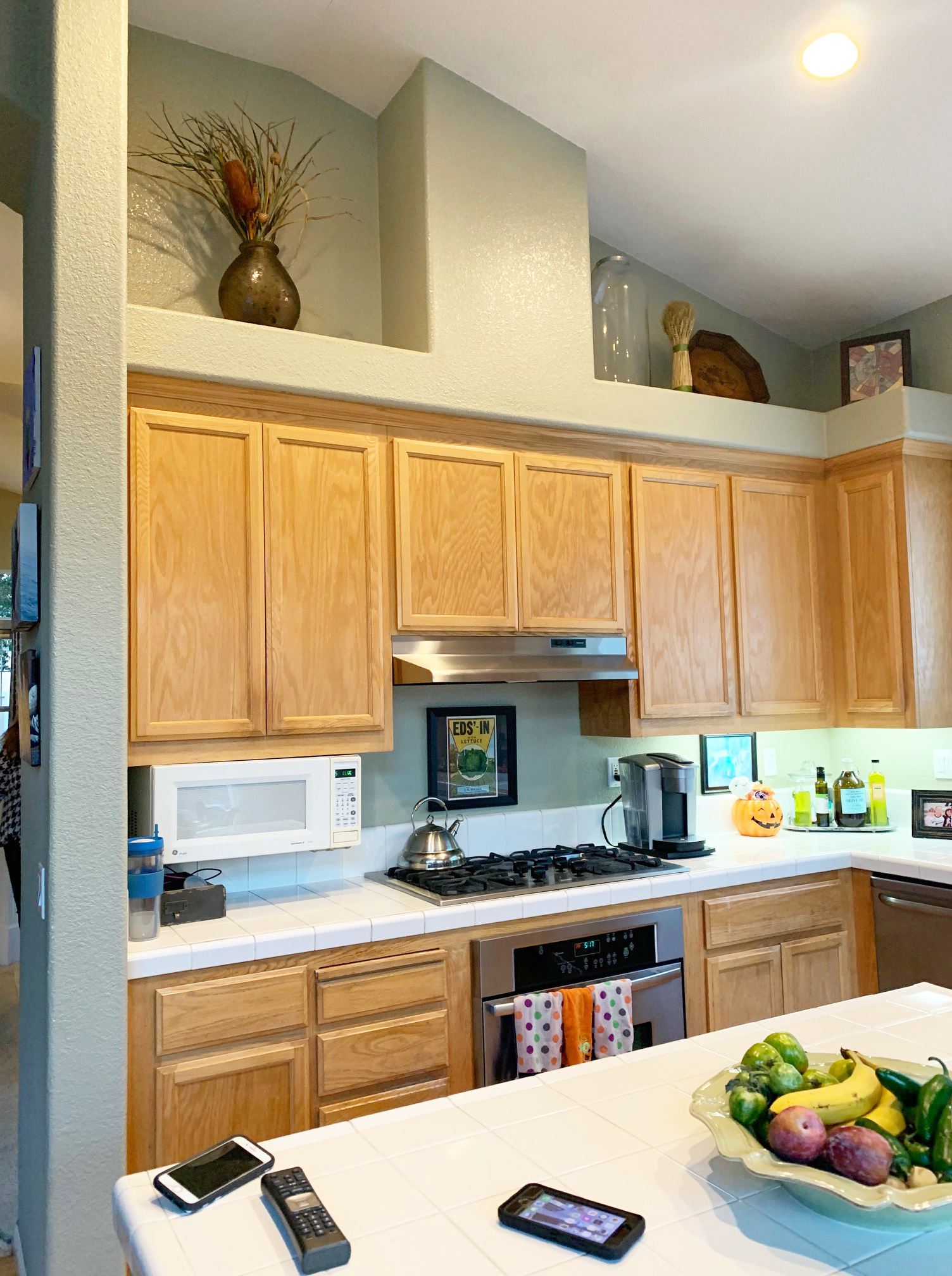
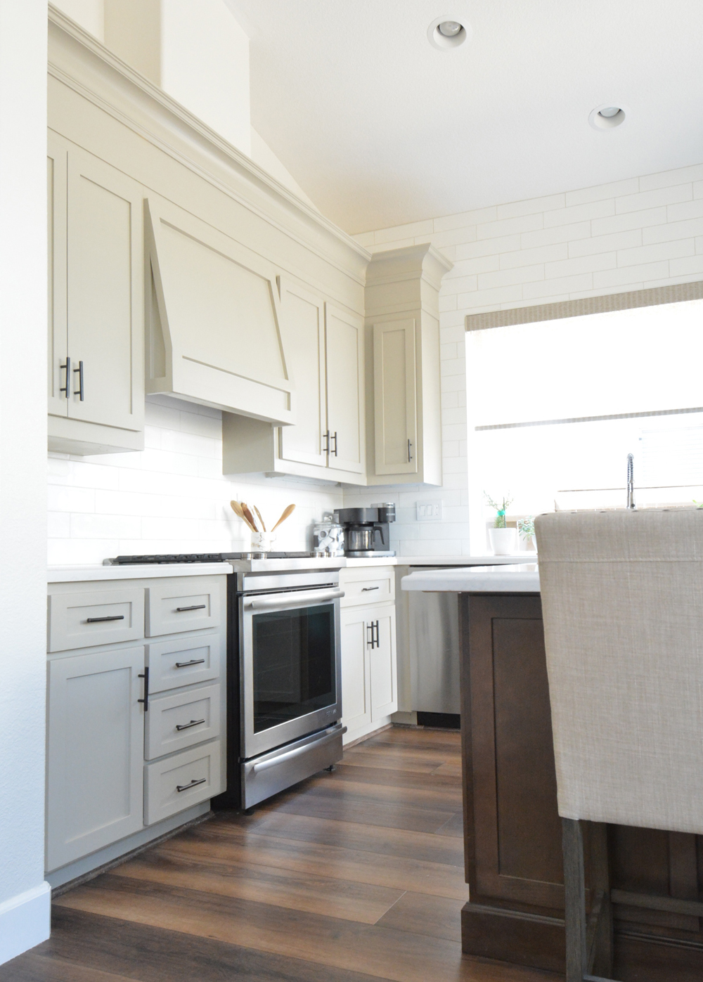
In the very beginning, we had a long discussion about what to do with the original cabinets. We went back and forth on whether to gut the kitchen and replace cabinets. Because the original bases were still in good shape and we weren’t shifting any appliances around, we decided the better plan was to replace the doors and drawer fronts and unite the bases and new doors/drawers by painting them all a beautiful taupe color.
Cabinet door and drawer replacement is a fantastic option for those who have great cabinet bases but want to freshen their kitchen space. For the replacement in Christina’s kitchen, we contracted with Fast Cabinet Doors and they provided Cristina with all new shaker inset panel doors and shaker inset panel drawer fronts. Thank you Fast Cabinet Doors!
The process was easy, but required attention to detail. All the cabinet door openings were measured so new drawers and doors could be constructed. Small detail, notice how we eliminated the pull out cutting board near the range and covered that spot with a taller cabinet drawer front. The new doors also came with new hinges for softer opening and closing.
While she waited on her new doors and drawer fronts, Christina researched paint colors. Instead of picking up paint samples all over town, she used this service I recommended to have large adhesive paint samples sent to her home instead. The color she settled on was Benjamin Moore ‘Pashmina’, one of my suggested colors in this article recommending taupe paint colors.
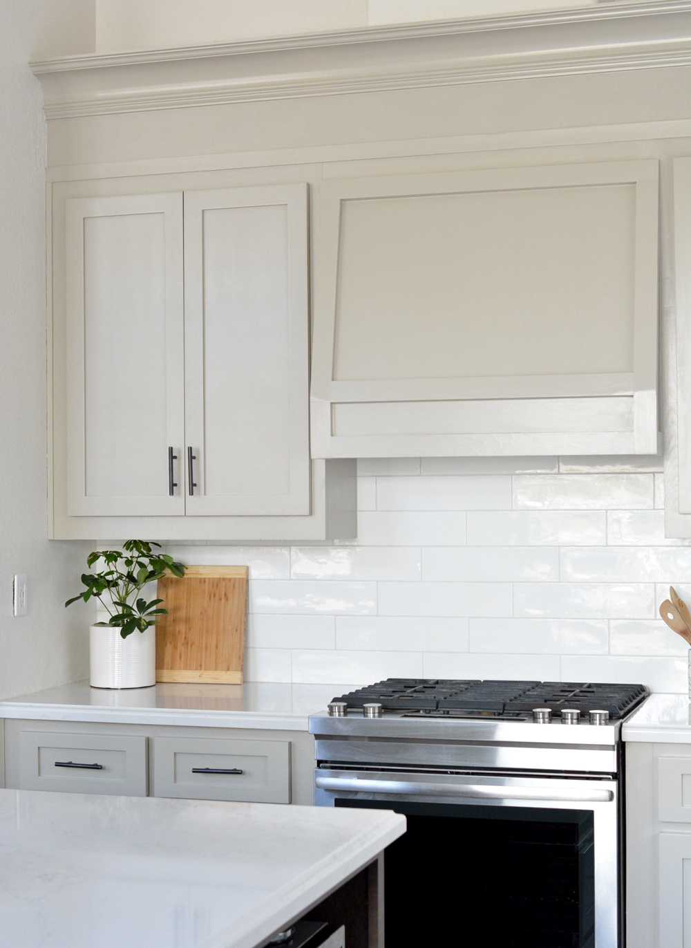
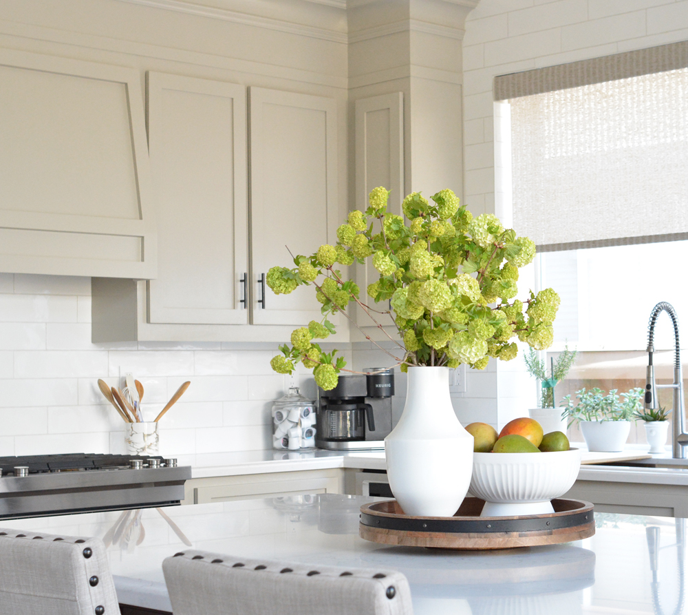
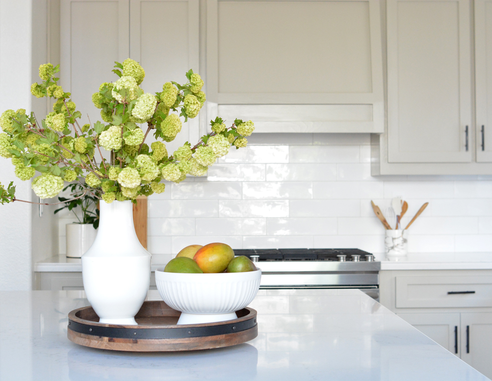
The backsplash is a larger scale white ceramic tile installed counter to ceiling in a staggered format purchased from Floor & Decor.
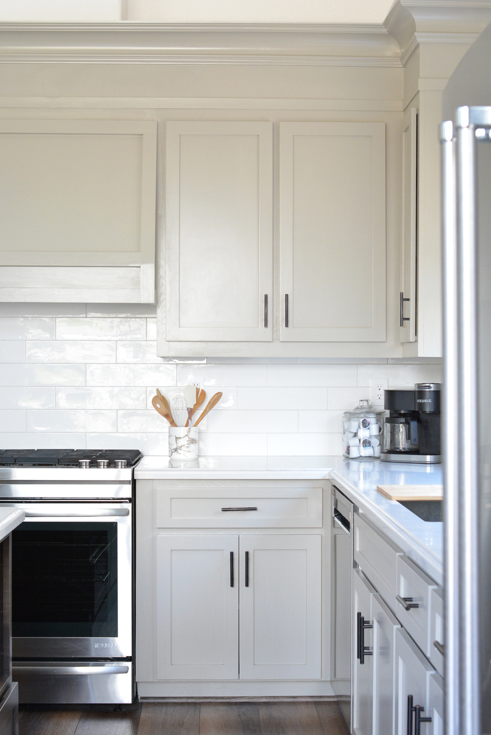
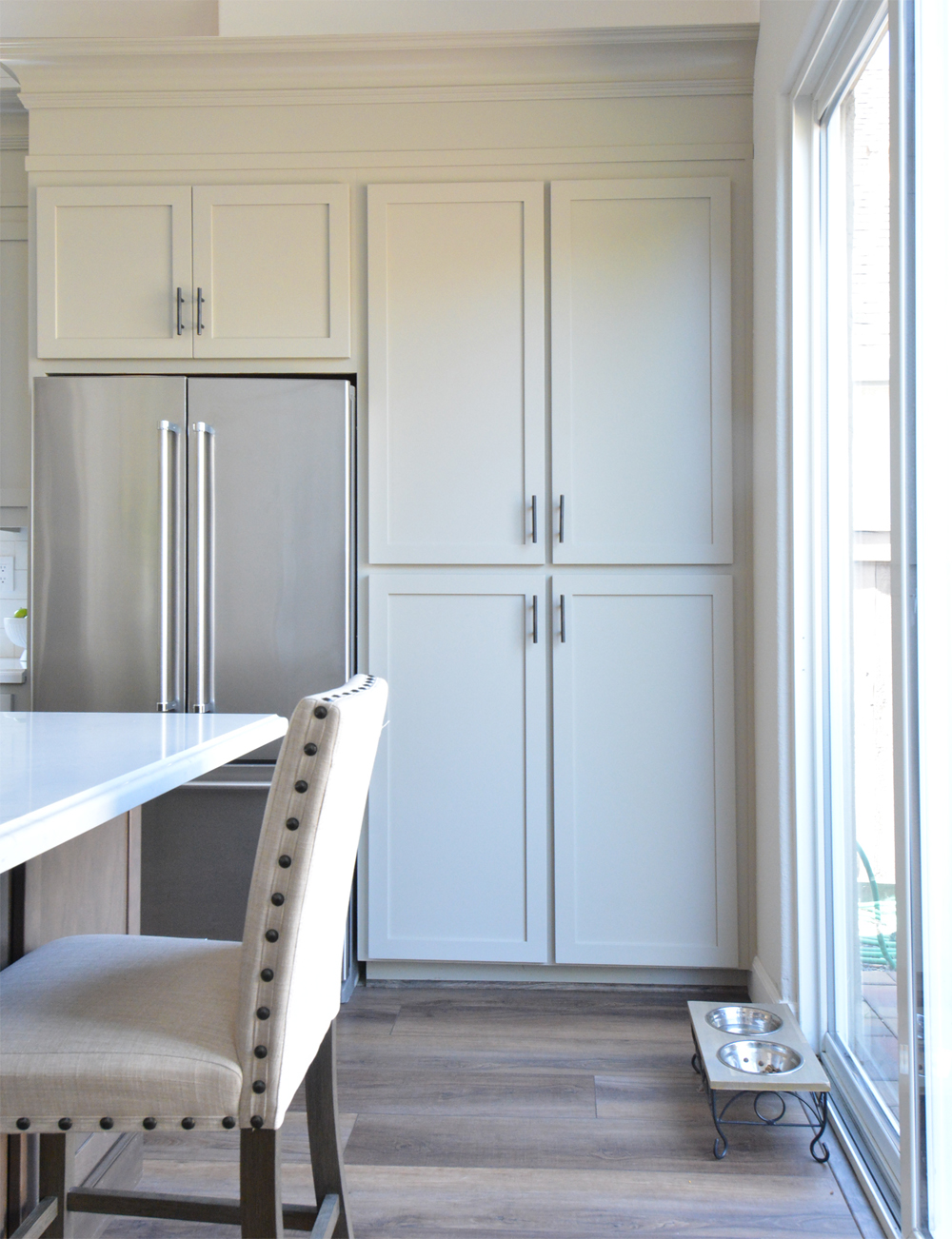
On the pantry side, I recommended they remove the upper soffit and fill the space instead with tall crown molding just like above the range. It’s a cleaner more sophisticated look. They also purchased a counter depth refrigerator so it would be flush with the cabinetry.
The floors are luxury wide vinyl plank and continue into her adjacent family room for seamless connection.
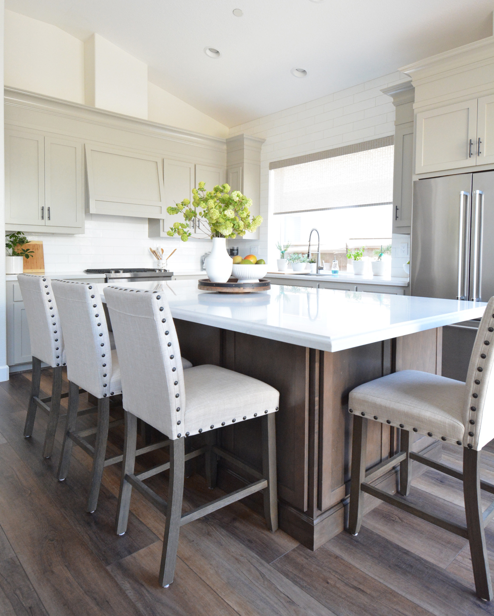
The island was a new addition and part of the new design plan. Before the space had a small island with ceramic countertop near the sink and space for a small kitchen table by the sliding glass door. My suggestion was to combine the two and create a long island with counter height dining chairs instead.
The new island by Kraftmaid cabinetry has drawer fronts that match the shaker style of the replaced door fronts on the surround cabinetry. Instead of a toe kick, we chose stained baseboard trim around the island for a furniture look. The microwave was also relocated to the island to save countertop space.
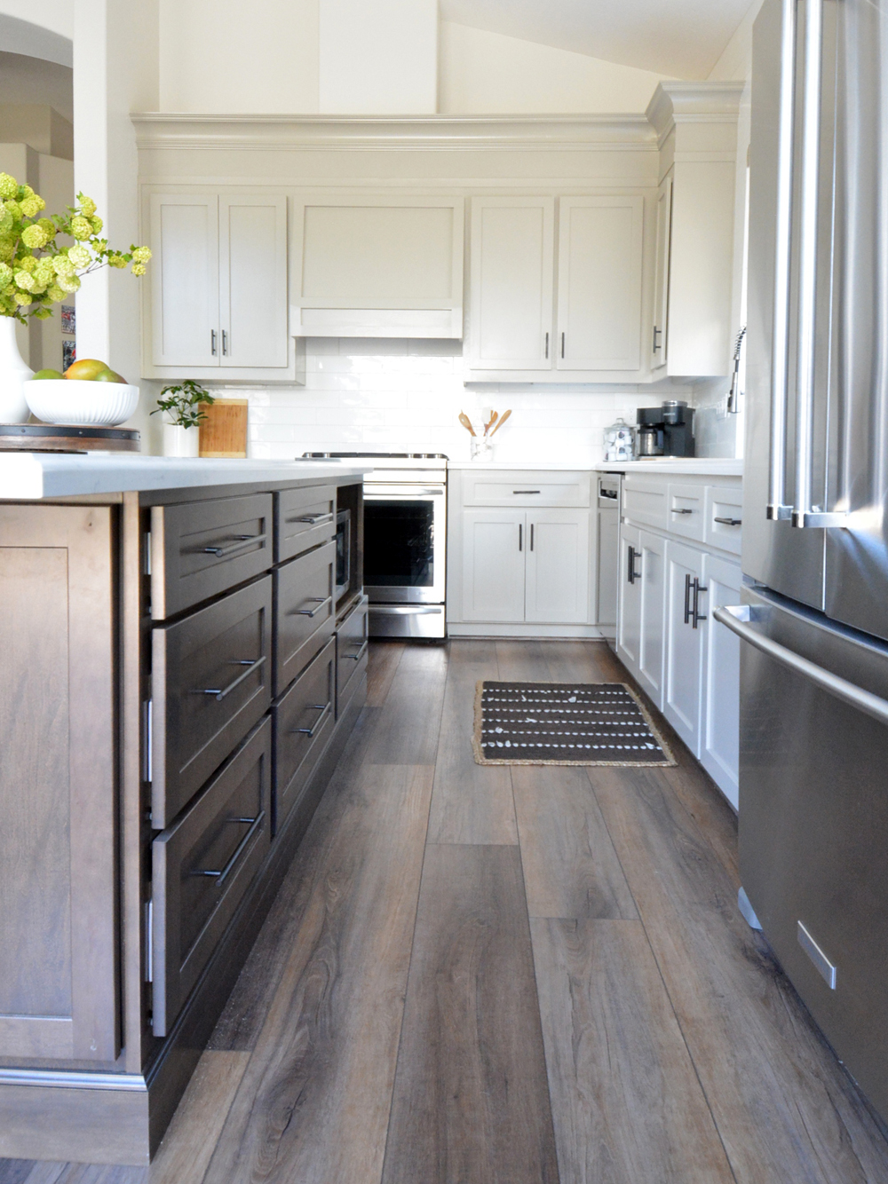
On one side the drawers have pulls, but on the other side where people sit, I suggested finger pull doors instead to avoid anyone hitting the hardware with their knees. Now Christina has a row of cabinets in her island on both sides for plenty of storage, and the elongated island countertop is perfect for meal prep and entertaining.
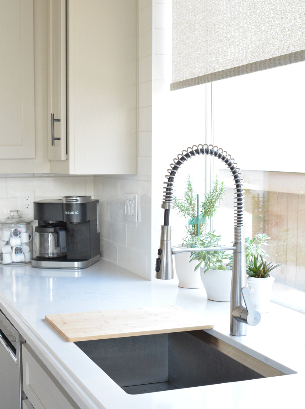
The dark hardware adds welcome contrast to a lighter and brighter space. The stainless sink is undermount and the faucet is from Costco.
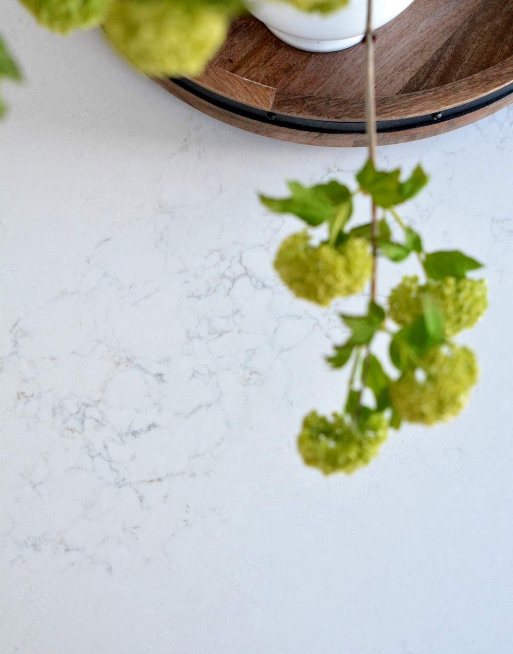
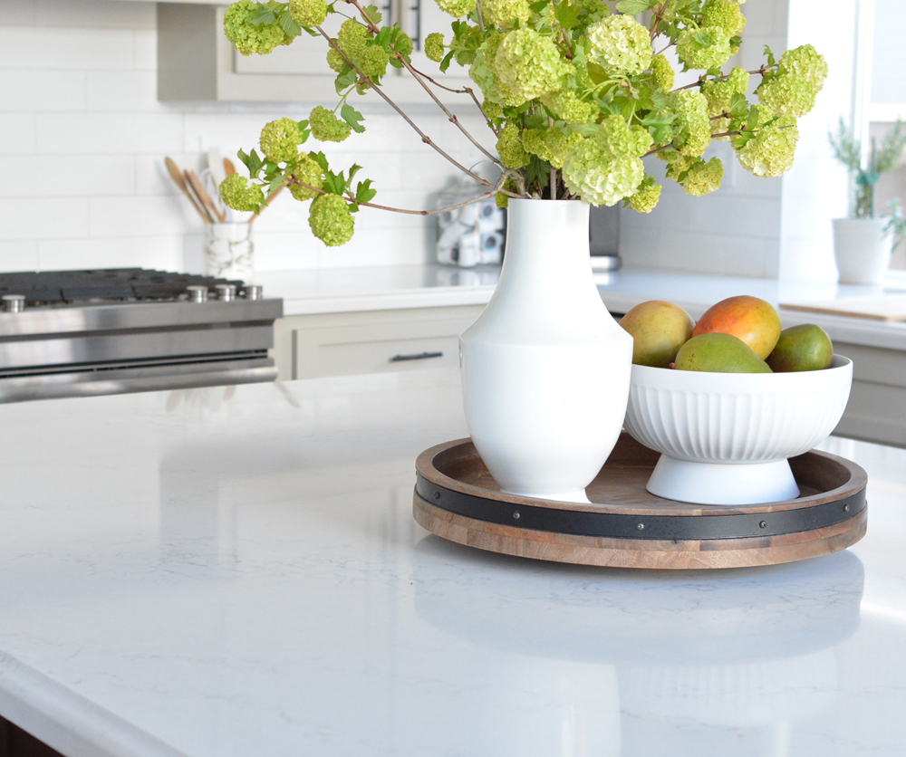
The countertop is quartz with subtle marble veining and Christina chose a routed edge to complement her transitional style kitchen.
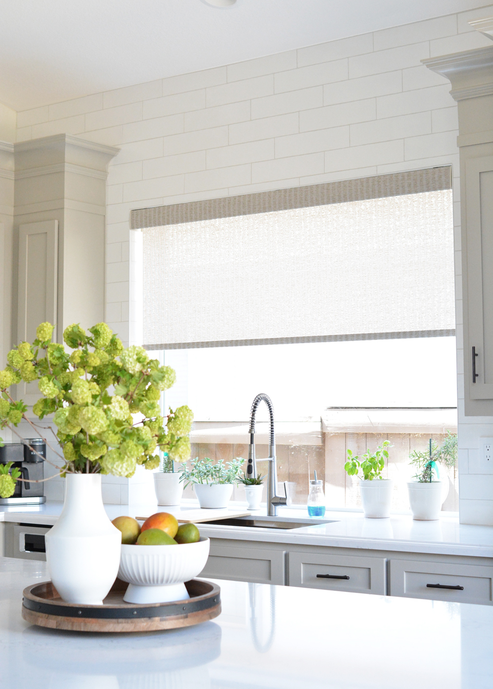
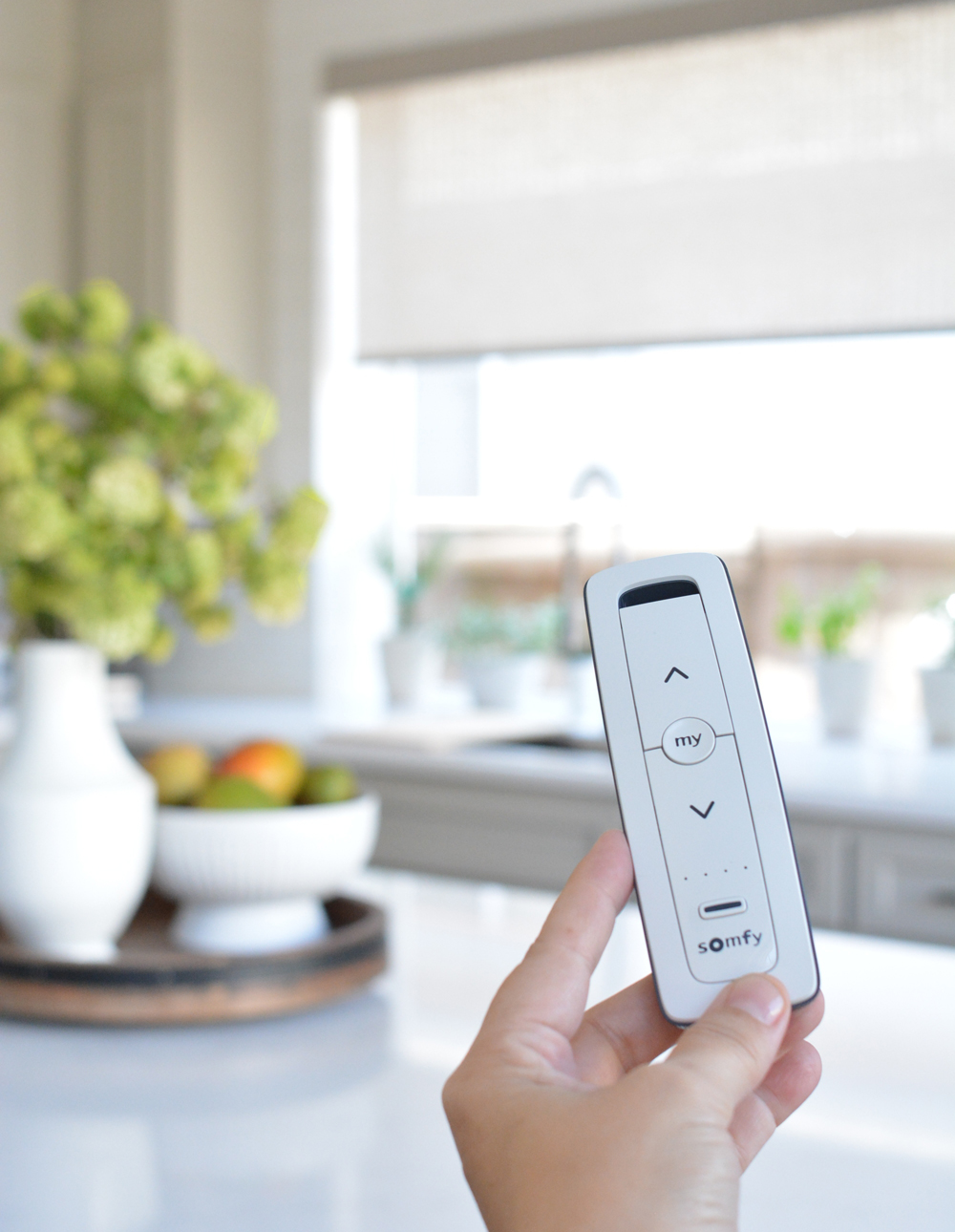
Here’s a worthy splurge, a motorized window blind! Christina needs natural light during the day but privacy at night so she purchased an inside mount shade with remote control. Light control at the push of a button, sweet!
It’s such a different space than when we first met, like a breath of fresh air.
What a transformation right? I’m so happy for Christina and John!

Let me know if you have any questions or want sources and I’ll reply in the comments !
Via HVAC http://www.rssmix.com/
No comments:
Post a Comment